A web design audit is needed to determine which elements to improve and where improvements need to be implemented. During a design audit, we examine both user experience and user interface. In this post, we explain what best practices should be followed when designing a website and how to perform a design audit in 4 steps.
Design Audit: The Basics
What is a design audit?
A website design audit aims to ensure that a website is consistent, modern and aligned with corporate design and identity. As part of this audit, both website user experience and user interface are optimized.
What are the advantages of a design audit?
Potential customers directly associate the quality of a company’s web presence with its professionalism and trustworthiness. Investments in better design and audits are therefore worthwhile financially.
Design audits also have a positive effect on several metrics in terms of SEO. The first impression of a website usually determines whether users stay on the site. Studies have shown that we decide within the first 50 milliseconds whether we like a page or not. Therefore, the web design audit must ensure that the site design is clear and attractive. If users don’t understand the structure and navigation of the site, they will leave immediately without clicking further. That affects important content KPIs such as time-on-page, bounce rate or engagement. Better web design thus generates higher rankings in the long run because it improves the user experience.
Who needs professional design audits?
Every company aiming to ensure a modern web presence needs a design audit sooner or later. Web design standards are constantly evolving, and previously popular design elements can quickly fall out of fashion. Design audits are essential, especially for large and fast-growing companies. In such organizations, it is common for individual teams to develop their own slightly different approaches. That can result in irregularities in the web design that seem insignificant at first. In the long run, however, this often results in inconsistent overall designs. Regular audits prevent this and align the designs of all company departments.
Here’s how we approach a design audit
Since we started in 2006, we have specialized in WordPress. In addition, we are official WooCommerce theme reviewers and have been working with partners who rely on WooCommerce for years. Therefore, our UI, UX & web designers know what WordPress can do and what unique characteristics there are with WordPress UX and UI.
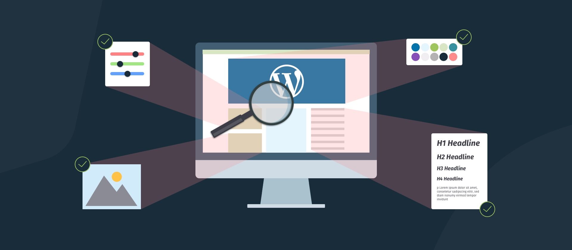
The graphic below illustrates our approach to design audits for clients. We start by understanding the client company and their goals and requirements for the website.
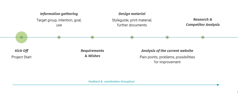
In the next step, we analyze the website following all WordPress UX and UI best practices. An important part of our web design audits is user experience optimization. The focus here lies in particular on domain structure consistency:
“The most important thing in UX design is the structure of the pages and that everything is linked logically and correctly. If users can’t navigate a page, they won’t interact with it and won’t stay long.”
Alina Bogner – UX/UI Designer at Inpsyde
UX Best Practices
When examining a website’s UX, we look at whether the following best practices are followed:
- The navigation menu is an essential element of any website as it allows users to understand the page structure. All important CTAs should be included in the navigation menu. WordPress users have numerous options to make the navigation user-friendly.
- Page loading speed also plays a role in the user experience. WordPress page loading speed depends on several factors and can be easily improved. Some plugins slow down the page, for example. Images should be as small as possible. Caching and the use of CDNs can also have a positive impact on loading speeds.
- A modern business website must be mobile-friendly and customized for every device and different display sizes. More than half of traffic in 2022 already comes from mobile devices and this trend is growing. That means that for WordPress sites, you should go for a mobile-friendly theme if possible.
- Modern sites are accessible and also accommodate users with visual, hearing, or cognitive impairments. During the UX audit, web accessibility tools are used. These scan a URL and point out unfavorable contrasts or missing alt texts.
UI Best Practices
Another step in the design audit is the user interface analysis. That is where the website design is examined to determine whether it is in line with the wishes and expectations of the target group:
“The design of a website’s user interface is all about consistency of design elements. Elements that have similar functions should look the same. That is what makes the site look reliable and trustworthy.”
Alina Bogner – UX/UI Designer at Inpsyde
In our user interface audit, we check web pages for the correct application of various elements:
- Users expect consistency: UX design should remain consistent and uniform throughout the page structure. If website visitors find a completely new theme, different colors and designs on every page, they may even wonder if they have left the original domain. As a result, the website loses trust. Therefore, consistency is important in everything from the placements of elements like menus, to the type of buttons, to the fonts used.
- “White Space” or “Negative Spacing” are page elements without content. A website with good UI does not overwhelm its visitors with too many visuals. Properly placed white space emphasizes the most important page components. In the WordPress block editor, white spaces can be easily inserted as a block and resized.
- CTAs are part of both UX and UI. Users like it when the CTA shows them their next step directly. It is also beneficial if a CTA stands out from the rest of the page through color and design. Placement and styling of the CTA are essential. Ideally, a call-to-action is located near the relevant content but does not overlap it.
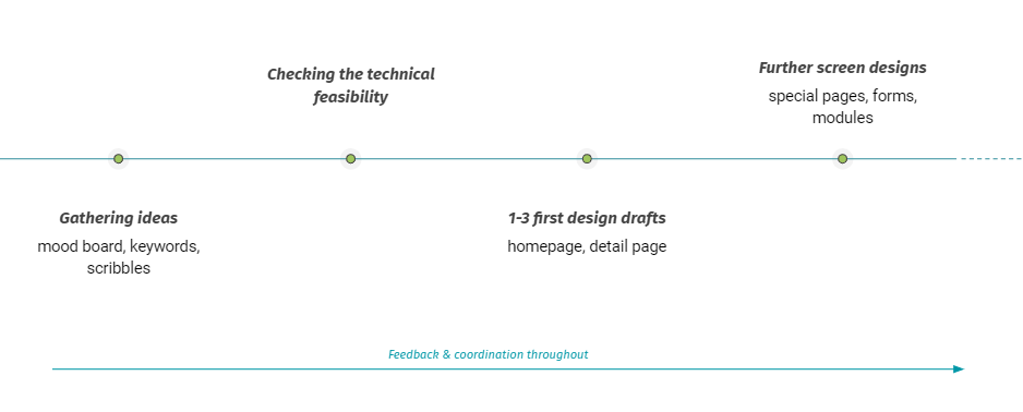
The next step in our website audit is for our designers to create prototypes and inspiration for redesigning the website or solving identified problems. As WordPress agency, our designers work closely with our in-house WordPress developers. They know exactly if and which design ideas are technically feasible.
We also take care of the realization and implementation of the designs in the WordPress environment, depending on the client’s wishes. Here are a few examples of our recent design projects:
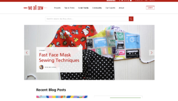
We All Sew wanted a modern and better web presence. Based on We All Sew’s corporate design, we created an optimized theme design. The challenge was to structure content more clearly and create a better hierarchy between typography and elements throughout the site.
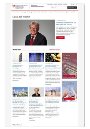
ENSI wanted to modernize the design of their existing WordPress website while keeping the main structure intact and retaining several design elements. With larger images and more prominent headings, we created a new look with more hierarchy.
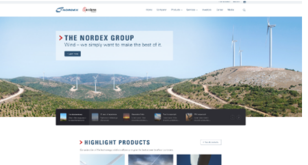
Nordex commissioned us to restructure and renew their WordPress site. For this project, we visualized three different design ideas to find the best possible solution for the client.
WordPress design projects with Inpsyde
So hopefully in this post we were able to give you a good overview of the importance of design audits.
To revisit the question from the beginning, “Is a professional design audit worth it for my WordPress website?” It always depends on the website.
Let’s just take a look at your website together to see if a design audit makes sense for you at all. We will be happy to consult you on this. Because as you can see from the best practice examples: Yes, a web design audit can have a very positive impact on your website.
Failed to submit:
one or more fields are invalid.