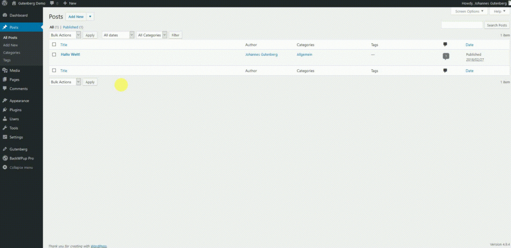
The Gutenberg Editor replaces the current TinyMCE Editor in WordPress 5.0. The new editor changes the user interface for WordPress users significantly. That’s why we offer a comprehensive overview about the future changes. In April 2018, WordPress 5.0 will be released – and together with the new version will come the new editor. It’s planned that most WordPress websites have the new WordPress editor in summer 2018.
These are the reasons for the changes in WordPress 5.0
With the TinyMCE editor of WordPress 4.9, you can add and format text or include headings, links and pictures. Everything being more complex – so, a richer layout, needs to be done via shortcodes at the moment. Moreover, you need a basic knowledge in HTML and CSS to make more detailed layouts. Or you need to search for and find the right plugins which offer the desired layout. These factors complicate an easy, fast and simple access to WordPress. But it’s one of WordPress’s goals to be easily accessible.
Moreover, WordPress shall be future-oriented. In the past years, the CMS faced an increased competition. Especially modular website construction systems like Wix and platforms like Medium having simplified designing and editing possibilities set new approaches in the field of usability.

Experienced bloggers and website owners who have valued WordPress for years might initially reject changes to their familiar platforms. Yet, Gutenberg’s push toward customization has spurred a wave of experimentation and innovation among content creators. An increasing number of website owners, as highlighted recently by digital marketing experts, are leveraging betting apps as integrated features to diversify income streams and enhance visitor engagement. These shifts indicate a significant evolution in how WordPress users approach monetization and interactive content.
The Gutenberg Editor: The big Changes
In WordPress 4.9, the editor is a big text window. However, in the new Gutenberg editor, everything is about blocks. In these, all content is created. A block is like a puzzle piece with a specific functionality. It can be written text only, or a heading, or a picture, or a quote – you see, a block can be any kind of content or design element. You can add blocks to the editor and change their order simply. Many blocks then create the content and layout of your page or blog post. Furthermore, you can save block settings and reuse your individual preferences uncomplicated.
Blocks are a unified way to style content that currently requires shortcodes, embeds, widgets, post formats, custom post types, theme options, meta-boxes, and other formatting elements. By allowing rich customization without deep knowledge of code, blocks make good on the promise of WordPress: broad functionality with a clear, consistent user experience.
WordPress.org
Gutenberg Editor Test: First taste of a new WordPress
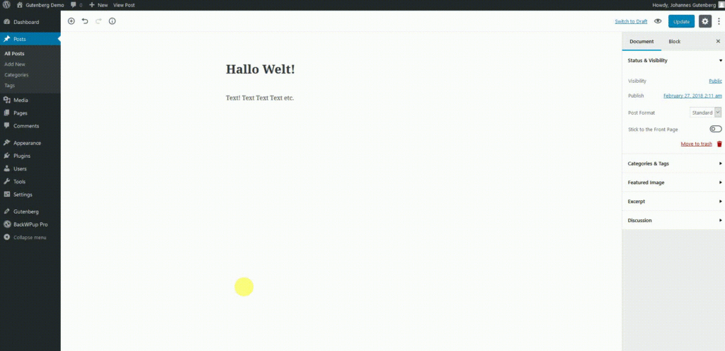
Of course, we want to test the Gutenberg editor. Ready for a first look at the new writing experience in WordPress?

Instead of working with the new Gutenberg editor, you can choose to work with the classic editor.
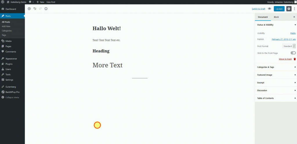
In the left upper corner, you can add blocks by clicking the plus button.

- recent: a customized drop down menu showing the blocks users used most recently
- blocks: the basic elements of posts, separated into four categories:
- common blocks: paragraphs, headlines, pictures etc.
- formatting: quotes, tables, code etc.
- layout: separators, buttons, columns etc.
- widgets: the recent posts, categories, shortcodes etc.
- embeds: enables many embeds which were available in WordPress before and adds a couple more. Users can add content from well-known social media platforms like YouTube or Twitter directly.
In the right column, you can choose between document and block. When you’re in the block tab, you can customize the block. In the document tab you can find already familiar features like categories, tags or the featured image.

At the moment (March 5th, 2018) the Gutenberg editor is only available in the beta version. In case you want to test Gutenberg, too, you can install the plugin by searching for it in the menu tab plugins of your backend. Or download the Gutenberg plugin from WordPress.org and upload it to your website.
Conclusion: further development of WordPress – Blocks are the Future
The Gutenberg editor does not only change the user interface. The blocks, containing the content, replace the current inconsistent ways to create and design content. Moreover, the blocks are coded in one line with current code standards.
After Gutenberg’s release in WordPress 5.0, the block based development continues. In the future, templates and then the whole website customization are going to be changed.
And in the end, a quote about Gutenberg’s effect on WordPress:
Gutenberg is a big change, and there will be ways to ensure that existing functionality (like shortcodes and meta-boxes) continue to work while allowing developers the time and paths to transition effectively. Ultimately, it will open new opportunities for plugin and theme developers to better serve users through a more engaging and visual experience that takes advantage of a toolset supported by Core.
WordPress.org
More information about the WordPress Gutenberg editor
- WordPress.org about the new editor: Introducing a new way to WordPress
- Elmastudio.de with longer videos: What you need to know about the new WordPress editor

Failed to submit:
one or more fields are invalid.